working portfolio
Allison Young
I will add to this portfolio as I create more pieces!
All pictures can be clicked on to view in full screen without the text!
Traditional Artworks
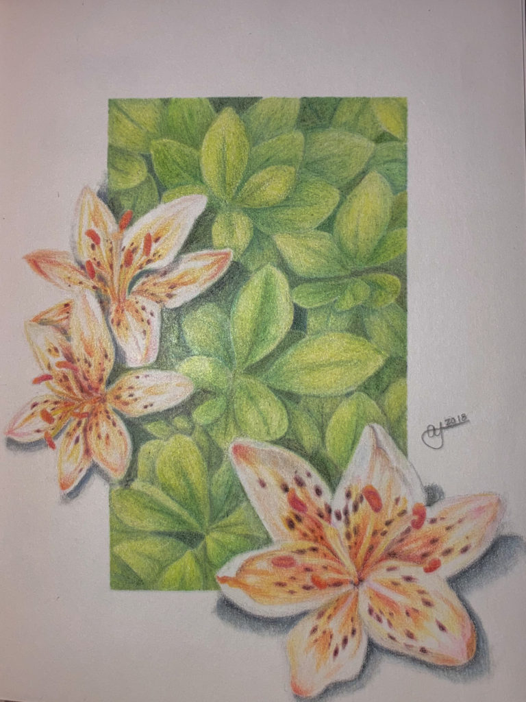
This is a colored pencil drawing I made in 2018. It is of my favorite flower, tiger lilies, and some leaves in the background. I sketched out the flowers first and then I taped off the square with masking tape. I then colored the leaves and removed the masking tape. Finally, I colored the flowers. 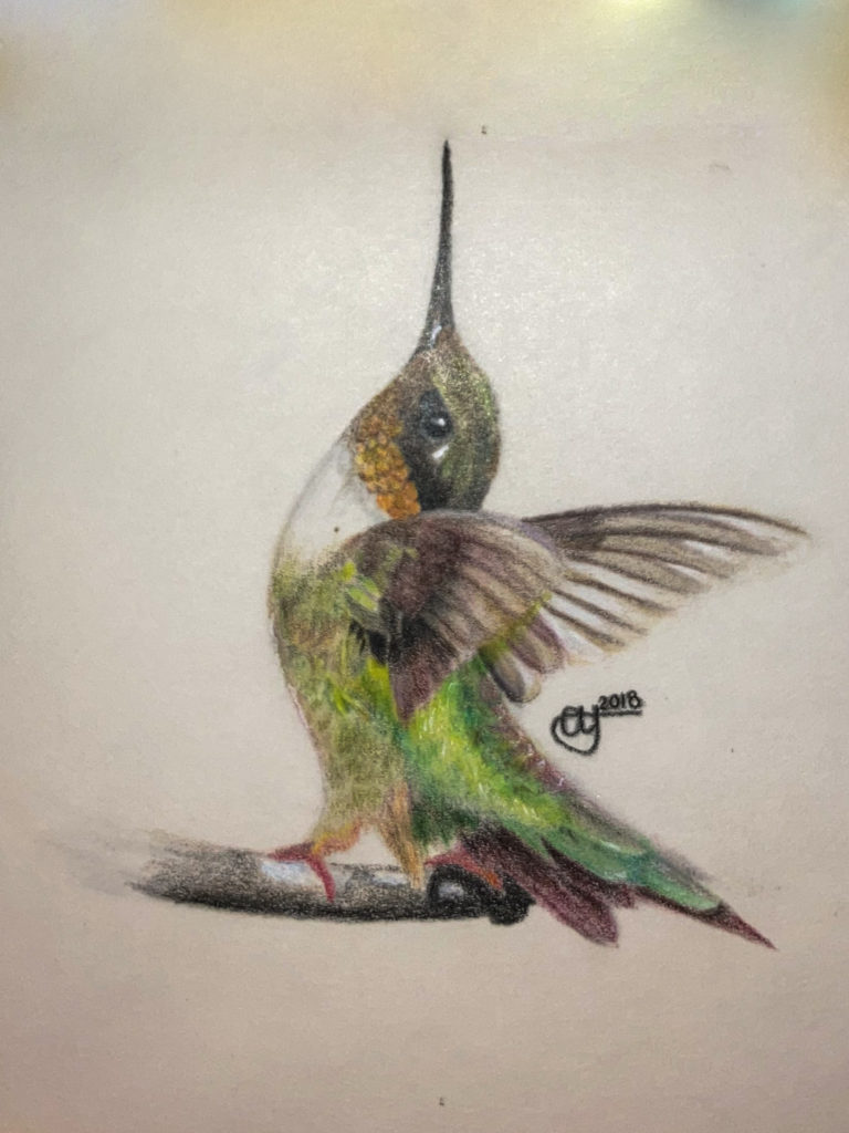
I also drew this in 2018. I originally drew this hummingbird in graphite in my sketchbook, and then thought it would look much better in color. To do this I put some semi-transparent paper on top and added color. 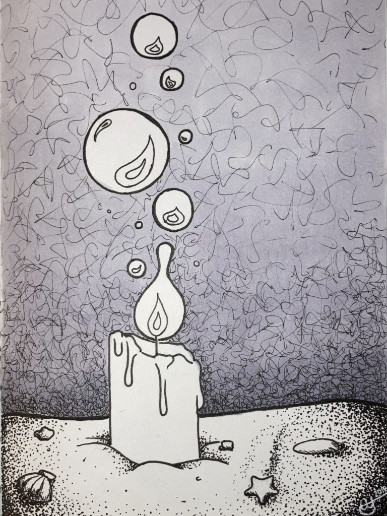
I drew this during “Inktober” in 2018. It is of a candle that is underwater. I used Blick alcohol markers to make the smooth gradient in the background and I used an outliner pen to do the line art. 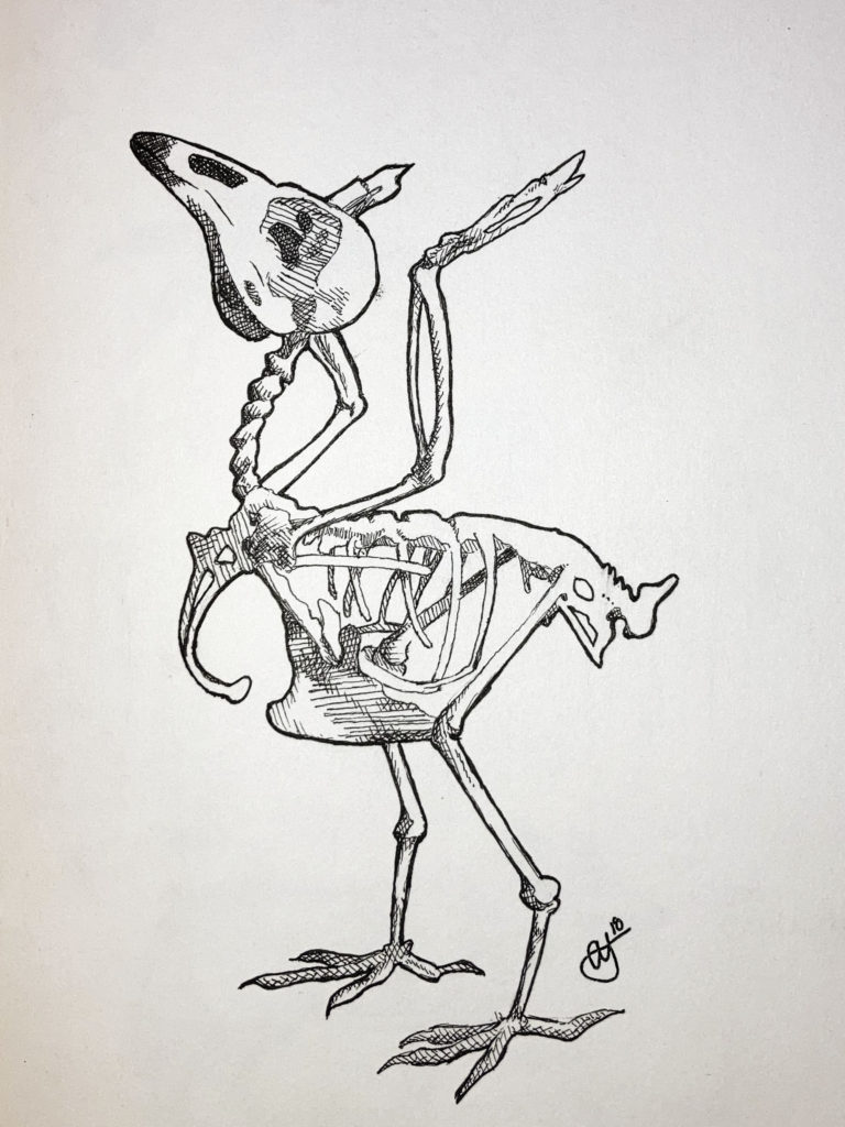
This piece I drew in 2018 as well. This was for an assignment in my drawing class. We were instructed to draw a skeleton and then scratch out the design in some transparent plastic. We then used the etched plastic to make prints of the drawings. I drew a skeleton of a robin because I thought the position it was in was very interesting. 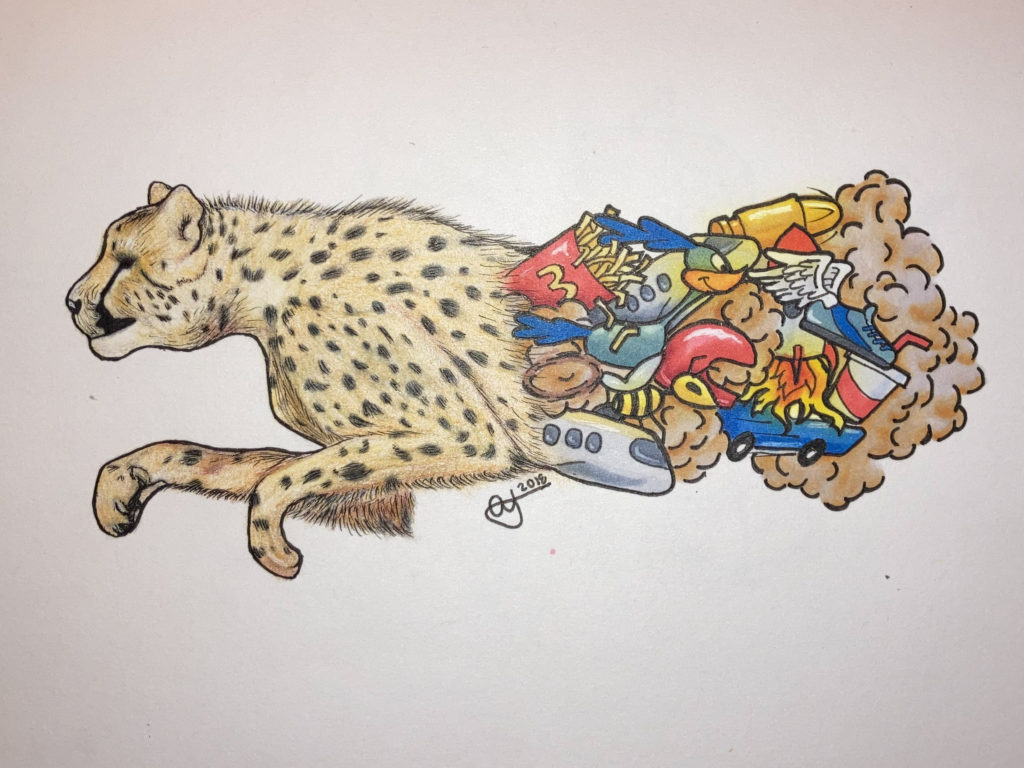
The idea behind this illustration, that I made in 2018, is that there is half the illustration that is realistic, and the other is in a cartoon style. The first half is a cheetah that are known for being really fast, and the second half of the picture is filled with things that are also fast (airplanes, fast food, the road runner). All around the other items are dust clouds emphasizing the speed at which they are moving.
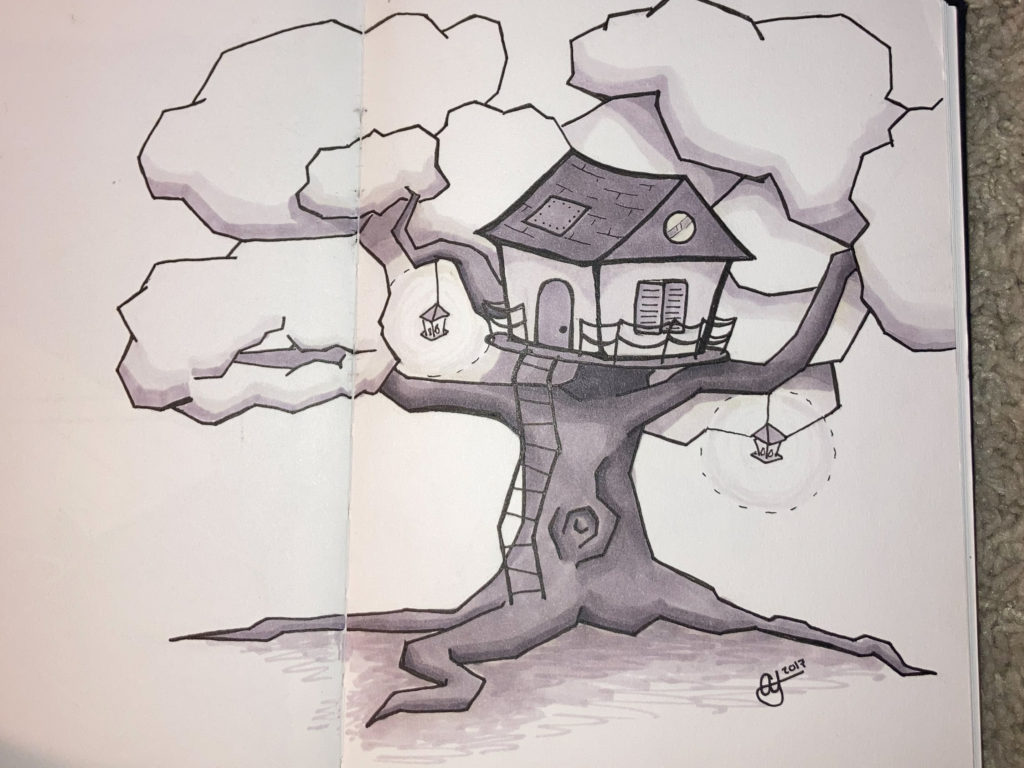
I made this in 2017 and I believe its one of my better works. I used Blick alcohol markers to create the different shades in the image. 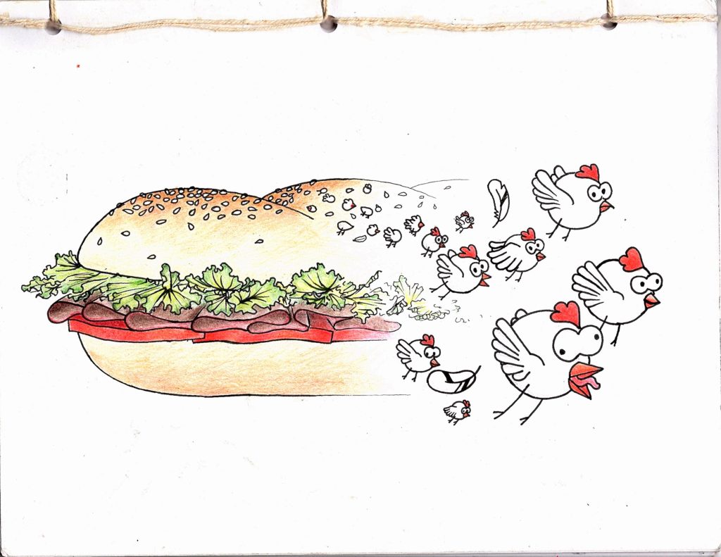
This is my sketchbook cover from 2019. I was inspired to draw this picture because on the day we were tasked with making it, I was really hungry for a sandwich. Halfway through I decided it would be really funny if the sesame seeds turned into chickens.
Digital Artworks
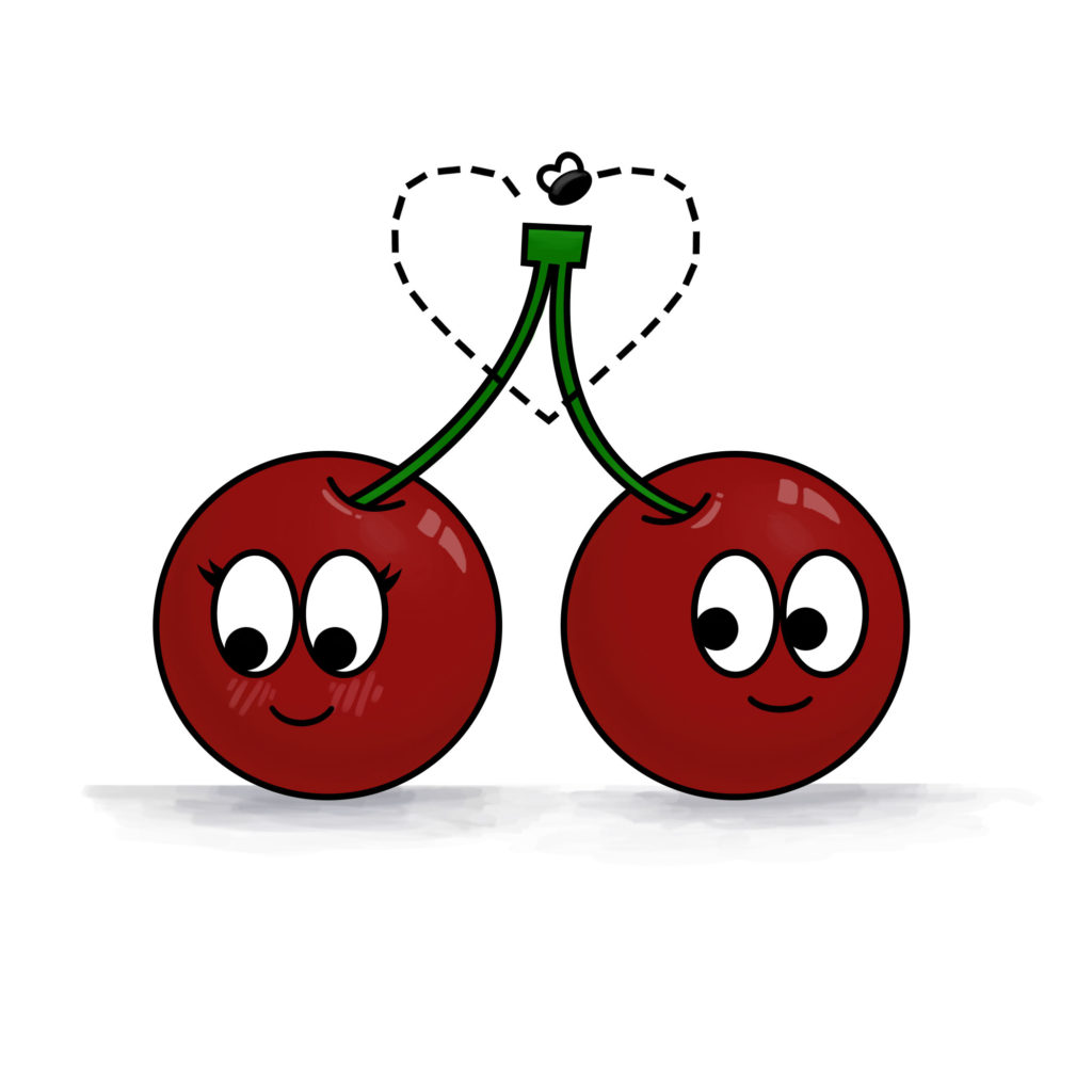
This is one of the first digital pieces of artwork I made in 2018. It is simple because I wasn’t as experienced with photoshop, but it shows my progress as an artist. 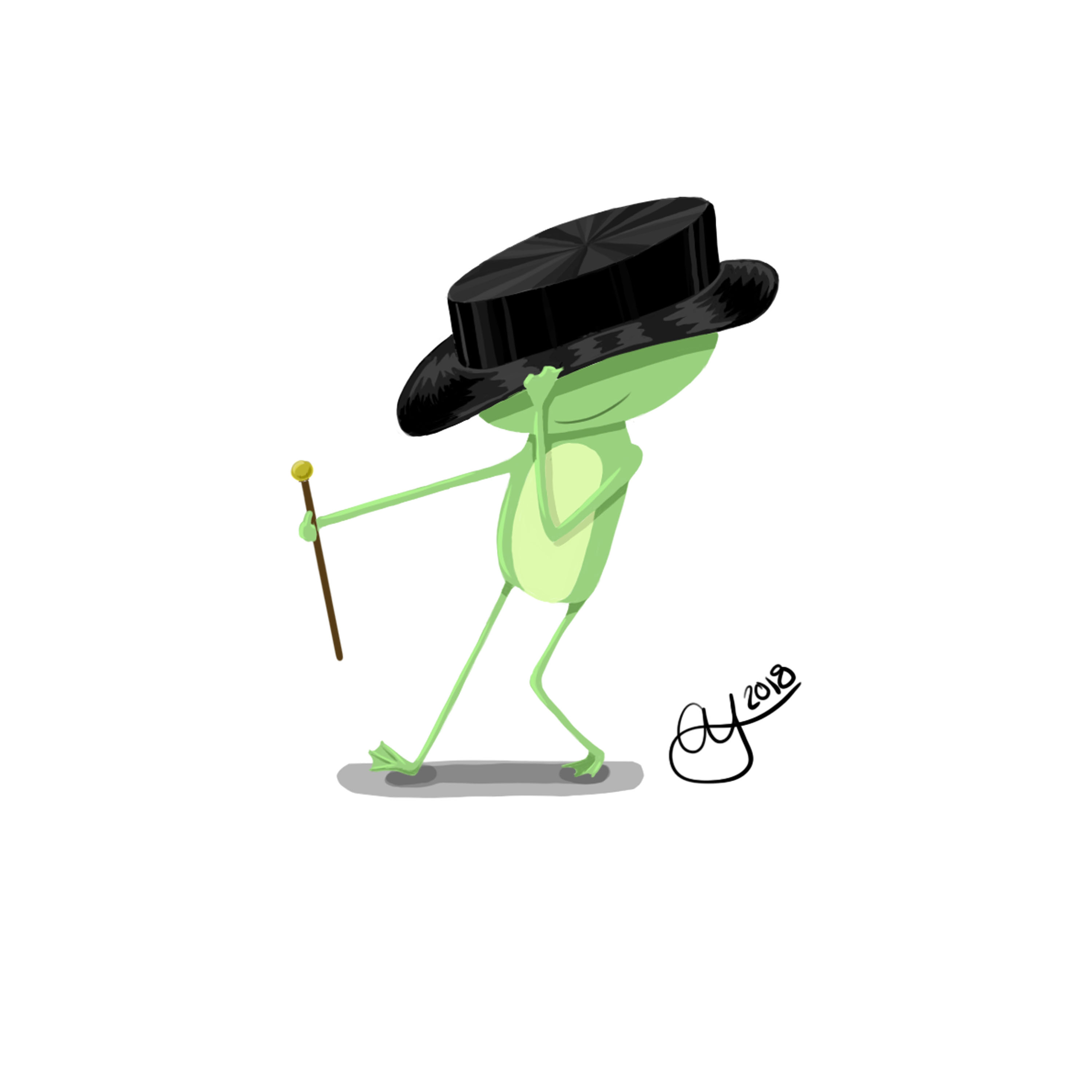
I made this artwork in 2018. I had an idea for a children’s book about a frog that learned how to tap dance, and this was going to be the main character. I never got to make the book, but I am still proud of the illustration. 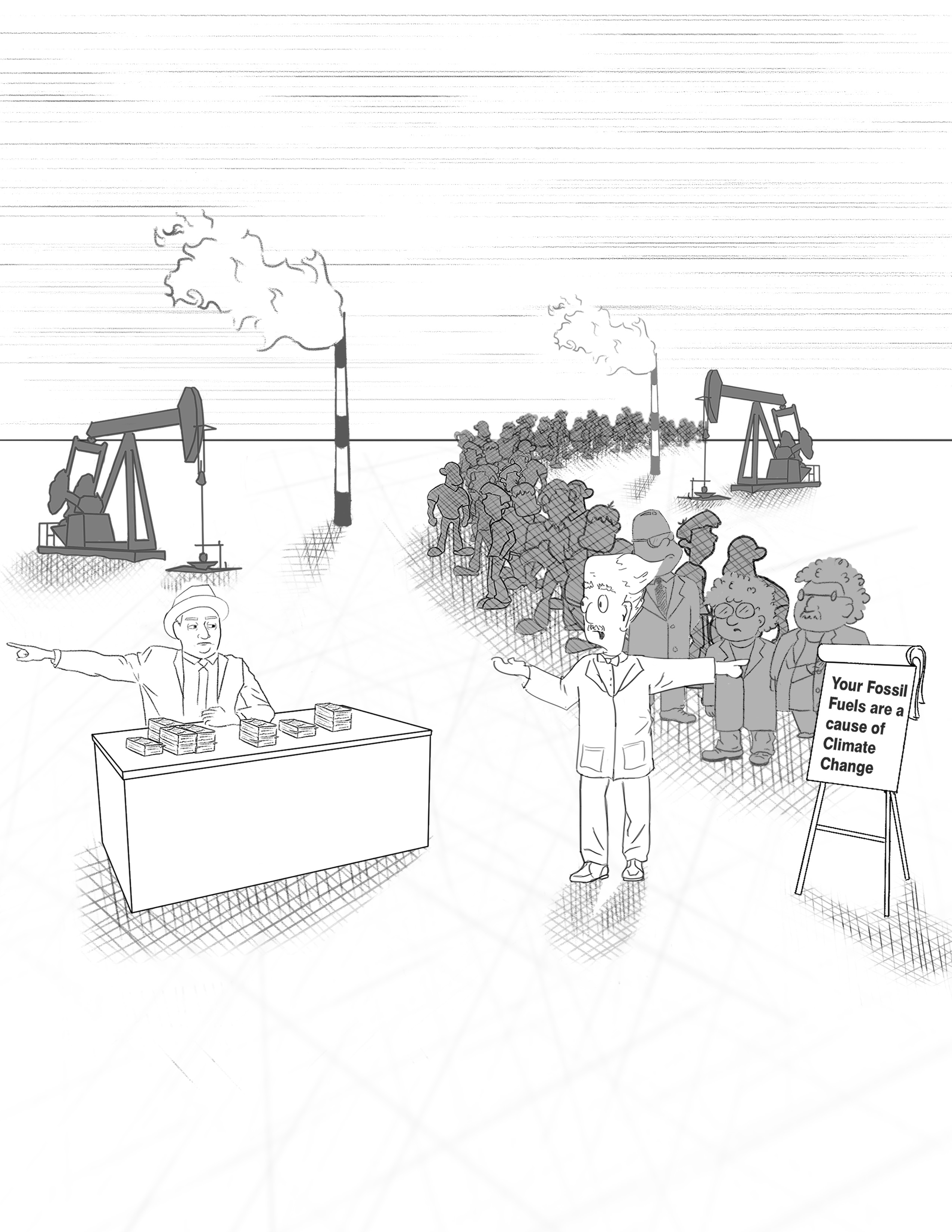
This is a political cartoon I made in 2019. It illustrates major oil companies rejecting any science that says fossil fuels are harmful. In the illustration, there is a line of hundreds of scientists all saying the same thing, and the representative of the carbon industry is rejecting them, hoping he eventually finds a scientist that will tell him what he wants to hear. 
I made this artwork for an assignment to create a logo in 2019. This is a logo of water sloshing in a fishbowl, forming the shape of the moon with bubble craters. 
This is a still 3D rendering of a door hinge that I made in 2019. I modeled and rendered it in Autodesk Maya. 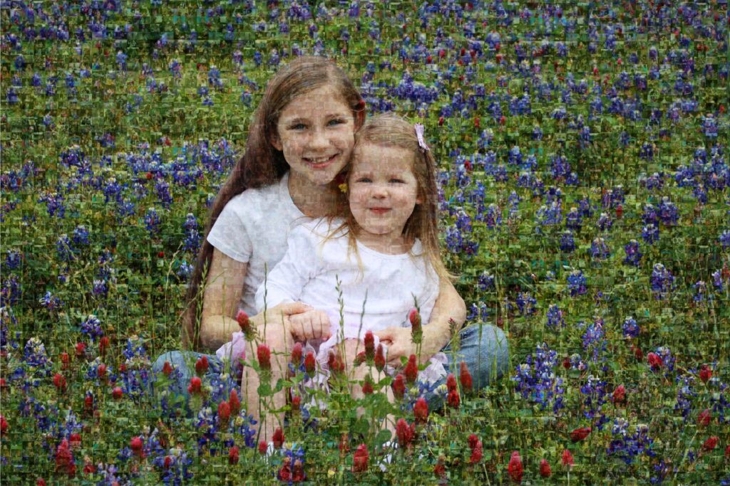
This is a collage I made using photoshop in 2019. My mother loves to take photos of us. I picked out all of the pictures of my little sister and me. I then selected over 200 pictures of us and formatted them to fit together, despite their different orientations and dimensions. I made the collection of pictures an overlay layer and put it over my favorite picture of us. 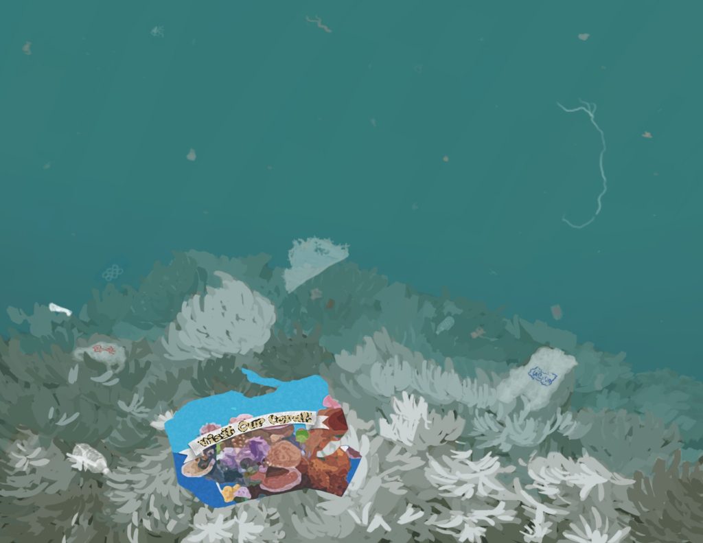
This is a picture I drew in 2019 of a bleached coral reef filled with trash. The ocean can be such a beautiful place but we are destroying it. In the foreground there is a piece of junk mail that says “Visit our Coral!” The irony is that the only beautiful thing in the picture is the piece of trash. The surrounding reef has died. 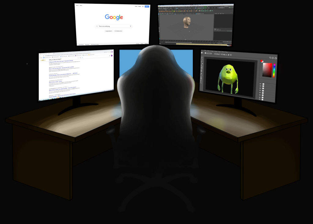
This is a piece I made in Photoshop in 2020. I asked my teacher for a prompt, and was given “If you suddenly became a multi-millionaire, what would be the first thing you would buy?” I created this image of my ideal animating studio. Everything in the picture is hand drawn except for the screenshots of the websites. This is an original character. I sketched her in my sketchbook then drew her in Photoshop. I wasn’t satisfied with the result, so I imported the Photoshop file and redrew it in Illustrator. Thereby, I was able to get crisp lines and a better outcome.
Photography
These are all original photos taken by me, and edited by me in Adobe Lightroom.
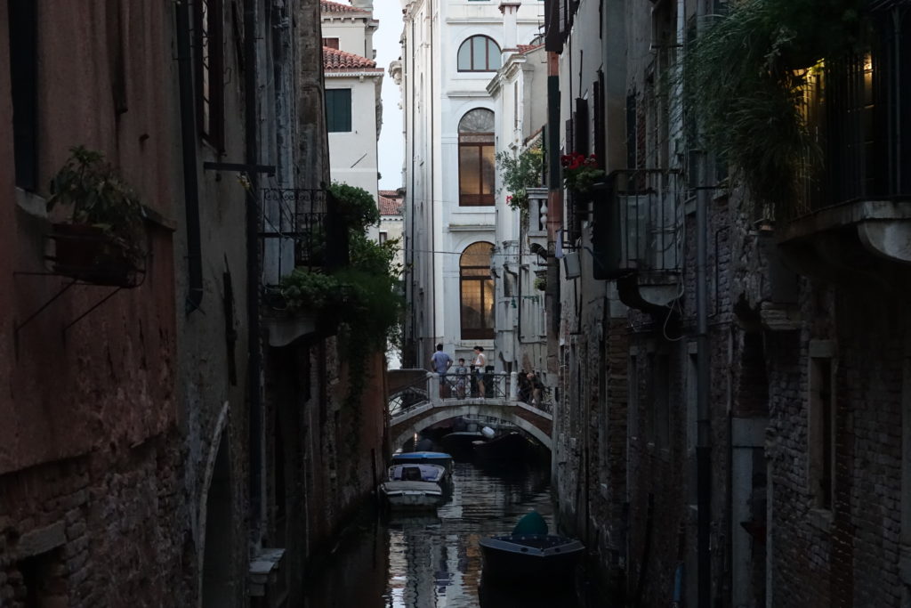
I took this picture while we were visiting Venice, Italy as a family. It was difficult taking photos in Venice since the tall buildings and small alleys block out natural light. Thankfully I was able to brighten it up in Lightroom, and emphasize the colors I wasn’t able to capture with the camera. The image to the right is the digitally altered version. 
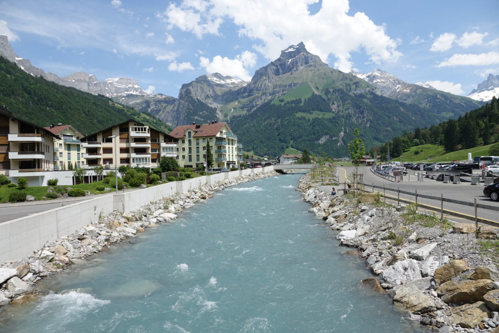
I took this photo in Switzerland at the bottom of Mount Titlis. I was inspired to photograph this incredible river that naturally looks like blue Gatorade! I wanted the blue water to really pop. So, in Lightroom I increased the contrast and saturation of the blue while lowering the saturation of the yellows and greens. 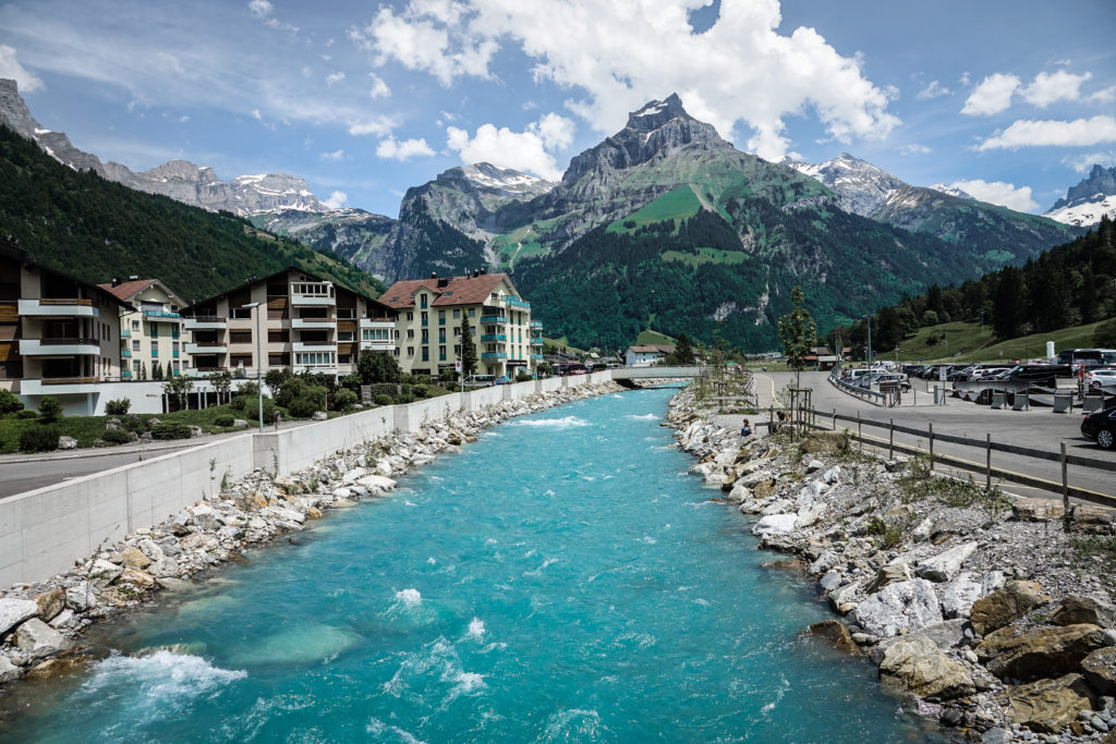
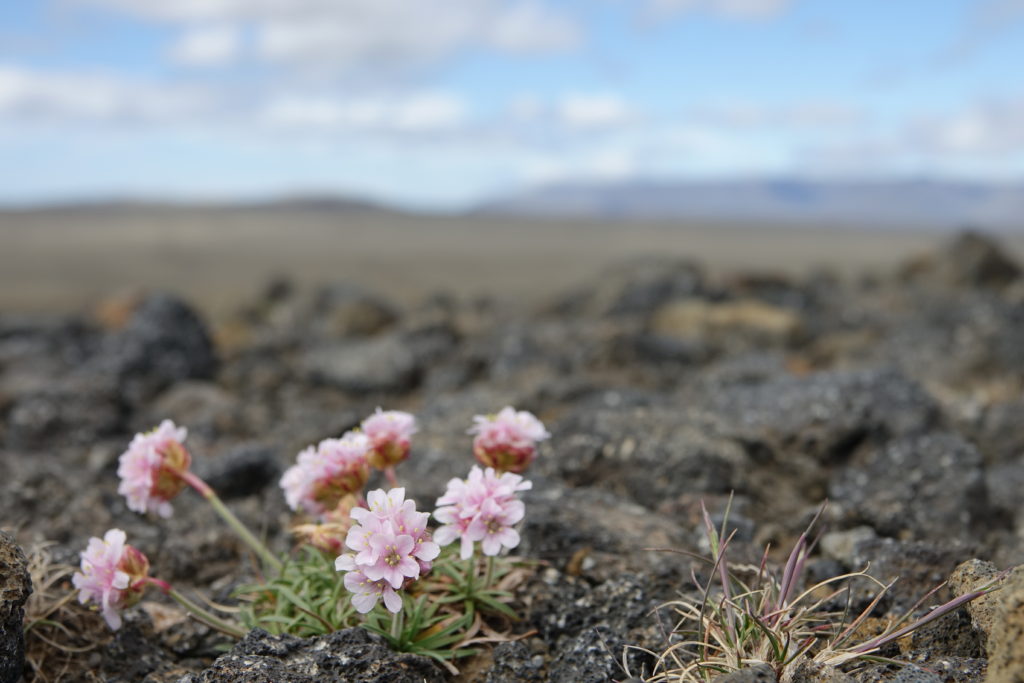
This picture was taken in Iceland. I was astounded by how desolate the landscape was. Initially I couldn’t see a plant for miles until I stumbled accross this solitary flower. Later, after much research, I identified it as the Saxifraga Oppositifolia, originally native to Sweden. The photo captures the vast wasteland behind it, while focusing on the beautiful bit of color that I happened upon. I further emphasized the colors with editing in Lightroom. 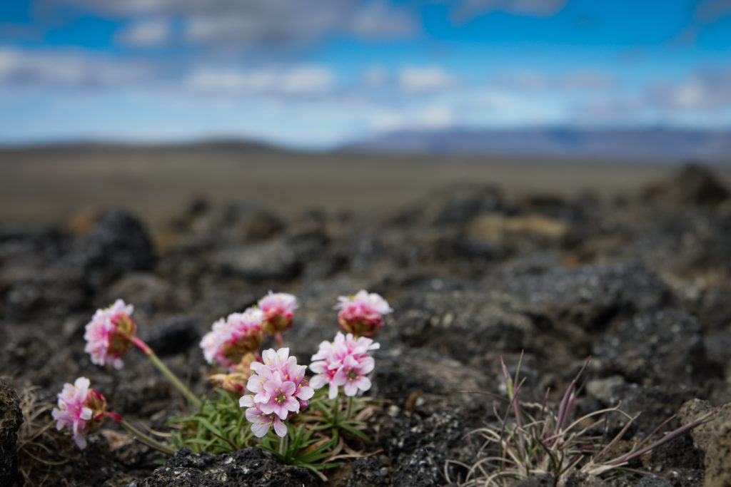
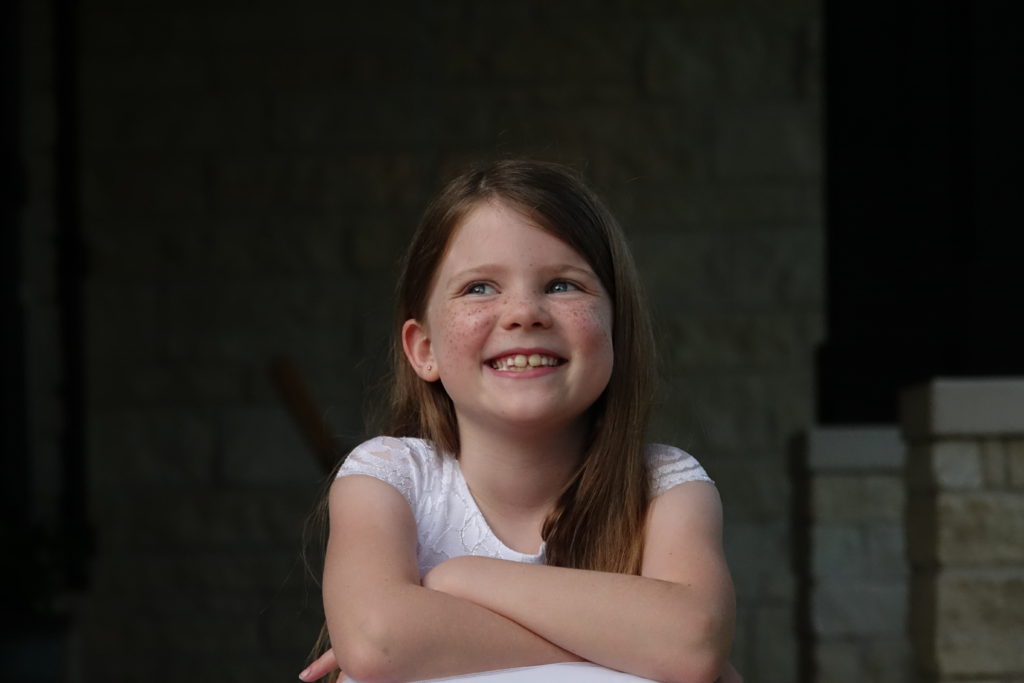
This picture I took of my younger sister when she turned eight years old and was about to get baptized. Because the sun was setting, I made the most of the remaining light by changing the aperture and ISO settings while maintaining focus. I loved the contrast between the bright subject and the dark background, and further enhanced it with editing. 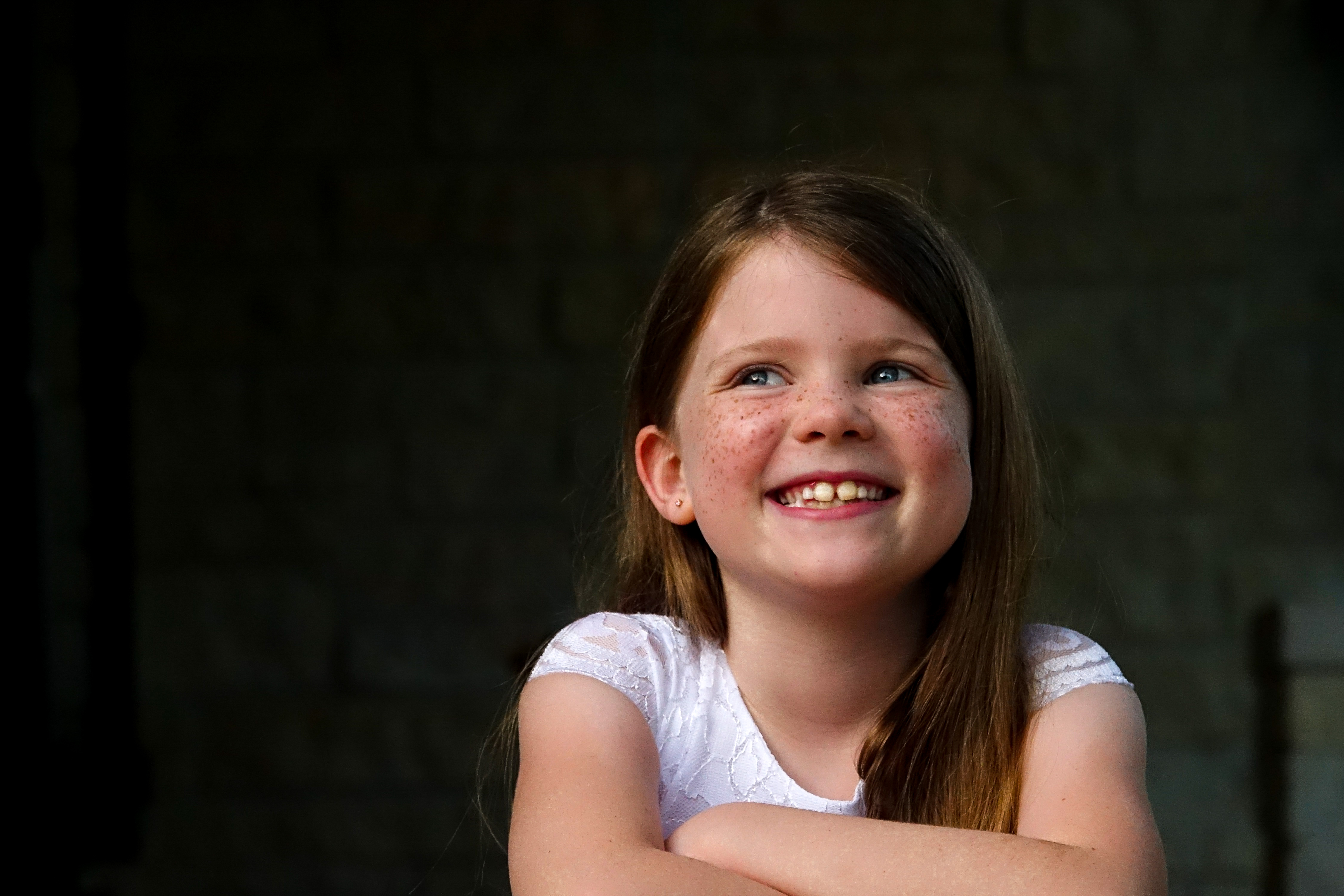
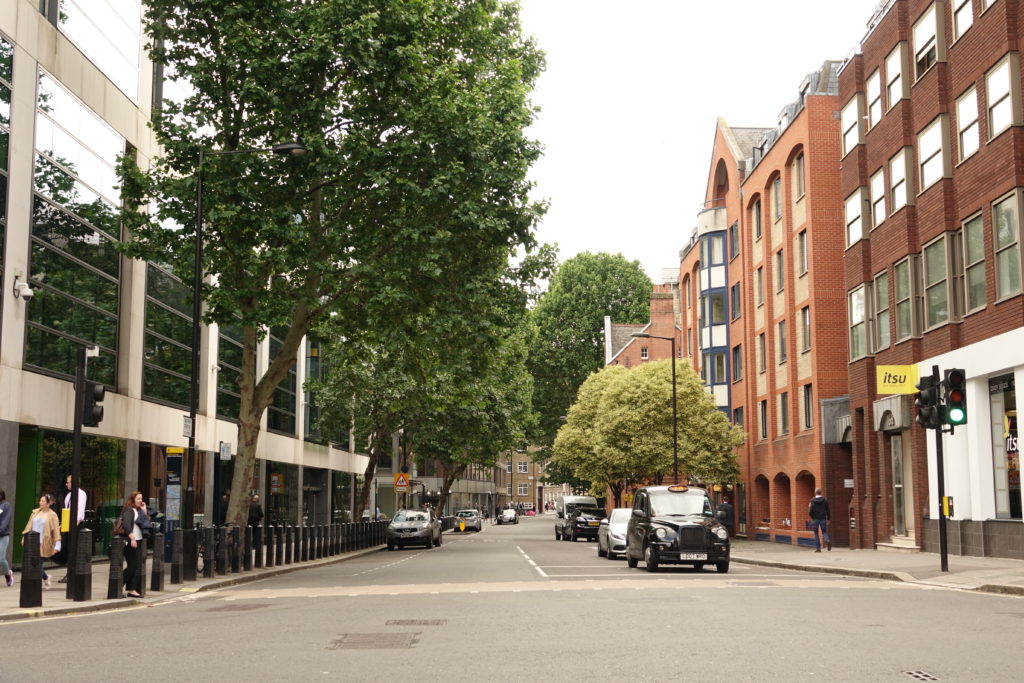
This picture was taken in London. I liked the contrast between the green trees and the red brick buildings. By using Lightroom to adjust the colors and relationship between the buildings, the final image gives the viewer a stronger impression of being at the scene, themselves. 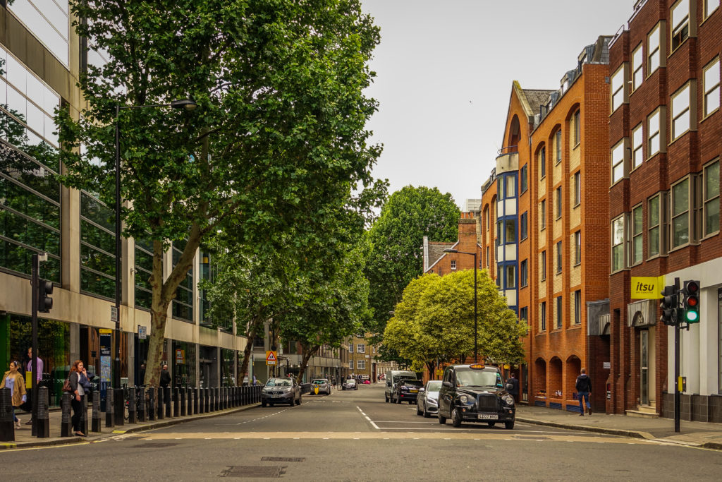
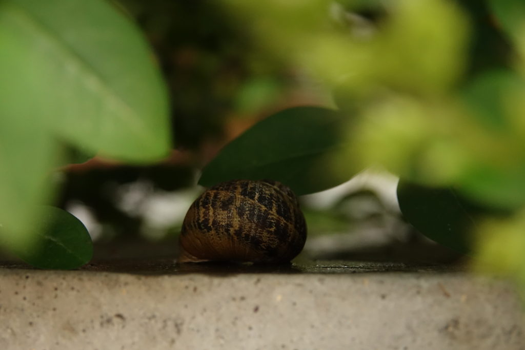
I also took this picture in London. One morning we awakened after a rain shower and found snails all over the road. My sister and I rescued as many as possible from being crushed, by moving them to the flower beds. In this image, I focused on one of the rescued snails in a manner that would prevent the viewer’s attention from being distracted by the leaves. During editing I further reduced the distraction of the background by increasing the saturation of the yellows and the sharpness. 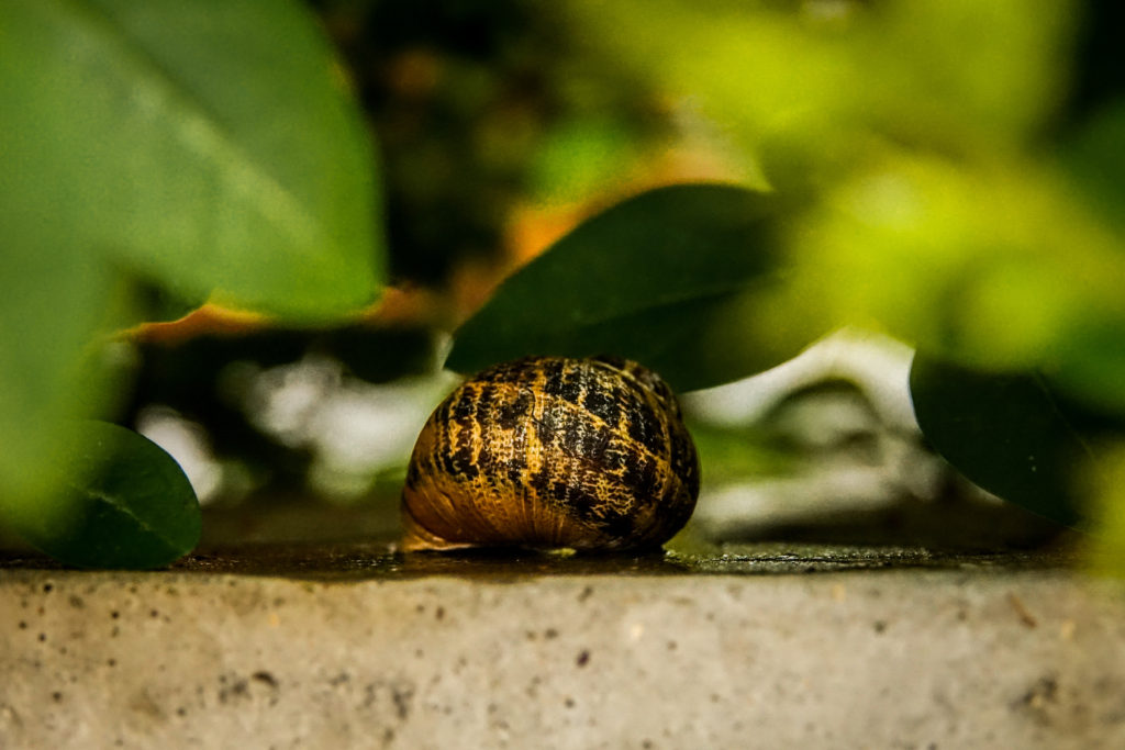
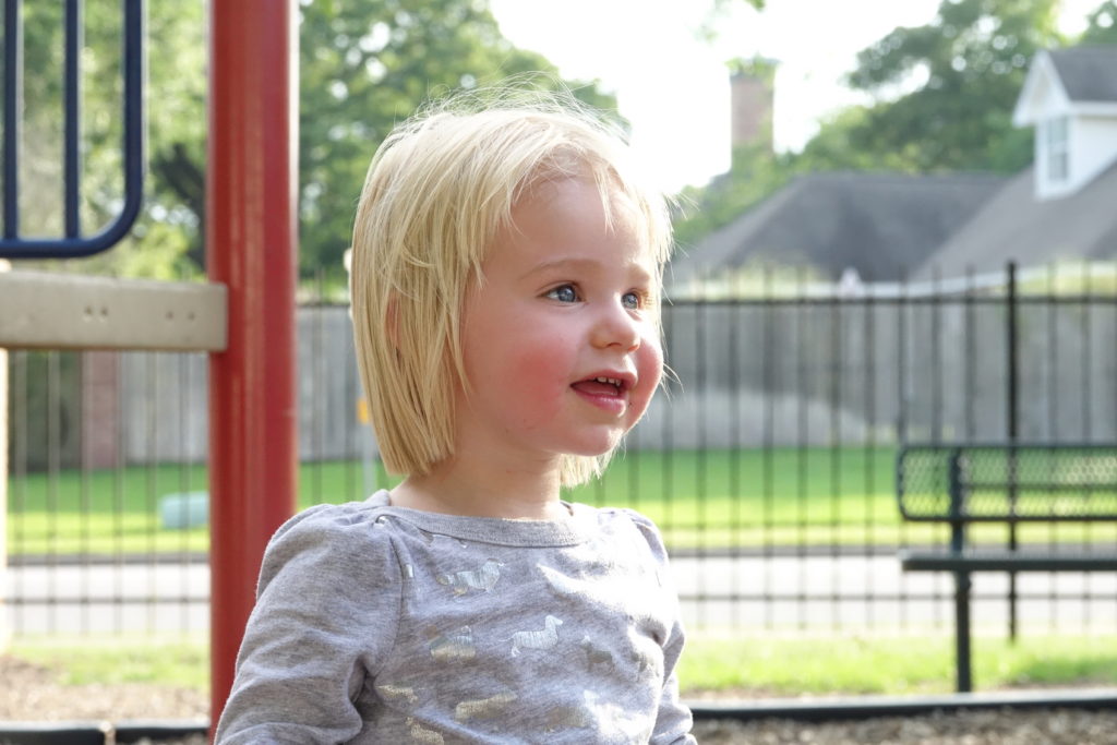
This is a picture of a family friend. As opposed to the picture of Venice above, this image didn’t require much editing due to the favorable lighting at the time I took the image. 